Snow Triple Play
A multi-mountain ski pass. 3 days, your choice of 16 different mountains.
branding | logo icon | logotype
Brand- Skiing has always carried a price tag that keeps people on the sidelines. Snow Triple Play is changing that. One card, three visits, sixteen mountains across the Northeast, built to be the most accessible entry point into east coast skiing that the region has ever seen. The brief called for a brand that felt as open and adventurous as the product itself.
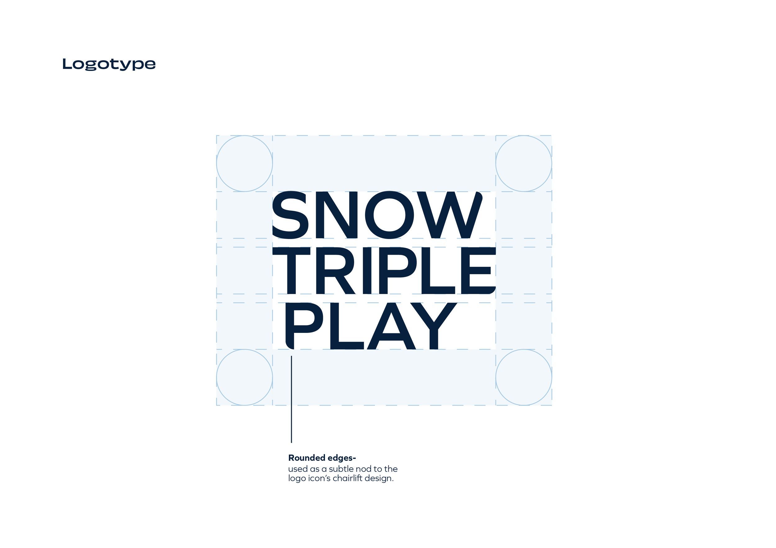
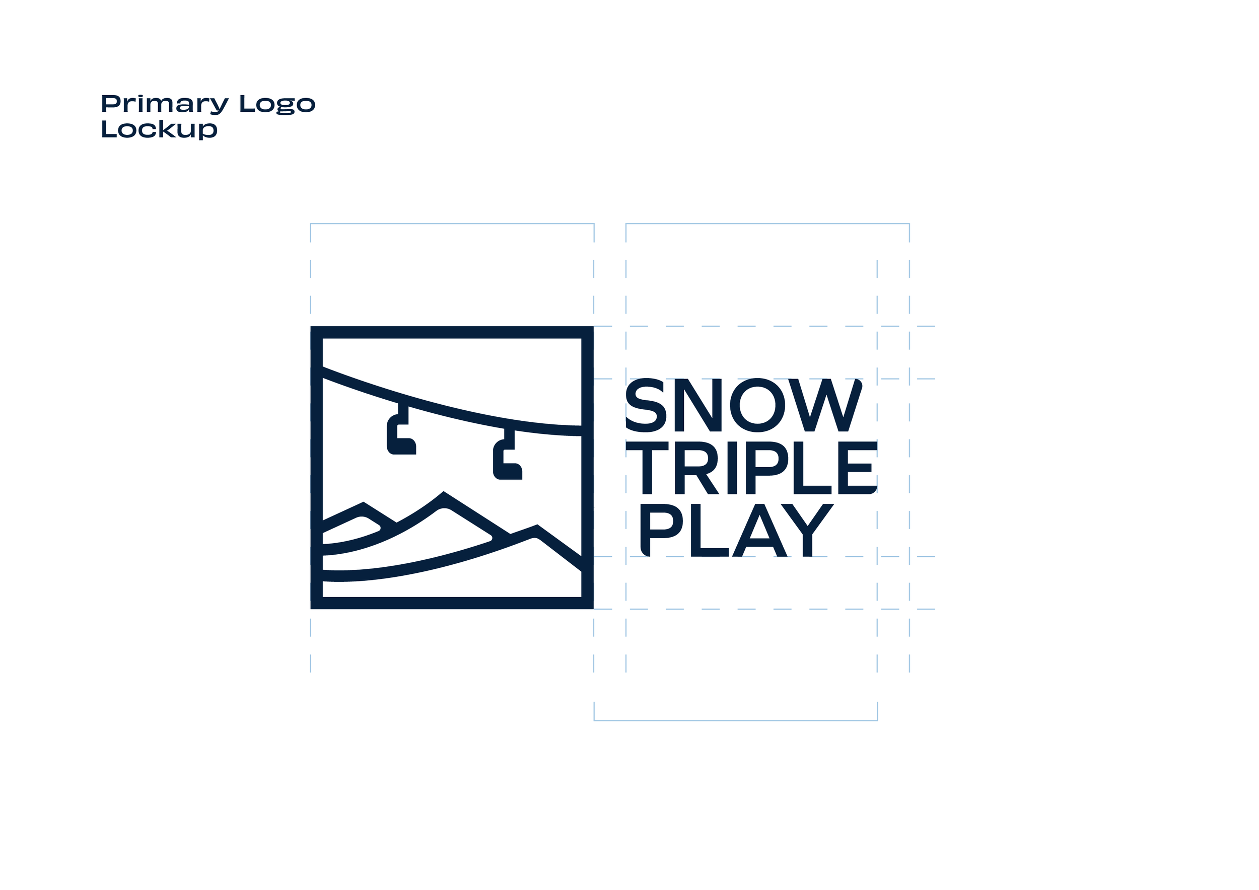
The identity is rooted in the idea of triple. Three peaks form the icon, a simple geometric mark that carries the product's entire premise in a single glance. The form balances rounded and pointed corners, a tension that echoes the duality of the mountain experience: approachable but with an edge. That same interplay is carried directly into the logotype, where the letterforms mirror the geometry of the icon, creating a system that feels considered from every angle.
Result- A flexible identity. The icon and logotype work together as a full lockup, or independently, giving the brand the versatility to show up across lift tickets, digital platforms, and partner mountain signage without losing its voice.